Anyone that has ever looked at local crime statistics has probably had the same initial reaction: “wow this neighbourhood has become so violent, I can’t ever leave the house again!” But a good data scientist understands priors, which is to say that it probably has more to do with the fact that there’s a huge number of people walking around, and even a small amount of criminal behavior would logically result in a small bit of crime anywhere. Therefore the question shifts: Considering that there’s some crime everywhere, are there more insert crime type here in my neighbourhood than in the rest of London? Let’s explore that!
(private 4th wall breaking note: with this exercise I also am trying something new. I first heard from Jenny and Hilary the myth of “the perfect analyst”, ie when one shares blogposts like this one, it can be a bit intimidating to junior data scientists in that they feel their experience using R is much more… iterative… to be kind. Therefore I have filmed my experience in creating this blog post in two videos, showing all my ugly mistakes, dead ends, google searching and everything! It’s a bit embarassing, but I think important. You can find them here and here. Please be nice! )
Getting the data:
The UK has excellent data reporting services, including https://data.police.uk/ from which we will obtain our data. After a bit of iterating, I think the data we need is in the Metropolitan Police Service, and I am downloading the latest data, a years worth. I am only “Including crime data” because that’s all we are interested in for now. I have downloaded these files into a local folder called blogdata. (in case anyone tries to run this Rmd but didn’t clone the repo… pls let me know if the relative referencing works correctly, still getting used to blogdown and hugo).
Now let’s read them in. By convention when I work w/ large datasets like this, I import it in once and then right away I create a smaller subset of the data to play around with, that way when I inevitably mess up I don’t have to load it all again.
FileNames <- list.files(path = "../blogdata",recursive = T, full.names = T)

df_large <- FileNames %>% map_dfr(read.csv, stringsAsFactors = FALSE)

df <- df_large %>% select(LSOA.name,Crime.type) %>% mutate_all(as.character())

df <- df %>%
  mutate(LSOA = gsub(pattern = " \\d.+", "", LSOA.name))
Let’s get to work!
Ok, perfect, so let’s calculate what the average amount of each kind of crime we can experience.
AveCrime <- df %>% group_by(Crime.type,LSOA) %>%
  summarize(CrimesPerArea = n()) %>%
  group_by(Crime.type) %>%
  summarize(AveCrime = mean(CrimesPerArea))
## `summarise()` has grouped output by 'Crime.type'. You can override using the `.groups` argument.Now let’s only study the 20 most violent neighbourhoods.
WhiteList <- df$LSOA %>% table %>% as.data.frame %>%
  arrange(desc(Freq)) %>% head(20) %>% pull(1) %>% as.character()

df <- df %>% filter(LSOA %in% WhiteList)
Plot!
OK, now let’s see how each of the 20 most violent areas stand up to the average amount of crime:
p <- df %>% ggplot(aes(x = Crime.type, fill = Crime.type)) + geom_histogram(stat = "count") +
  facet_wrap("LSOA") +
  theme(axis.title.x = element_blank(),
        axis.text.x = element_blank(),
        axis.ticks.x = element_blank()) +
  scale_shape_identity() +
  geom_point(data = AveCrime, aes(x = Crime.type, y = AveCrime, shape = 45, size = 2)) +
  ggtitle("Crime in the top 20 London boroughs")
## Warning: Ignoring unknown parameters: binwidth, bins, padp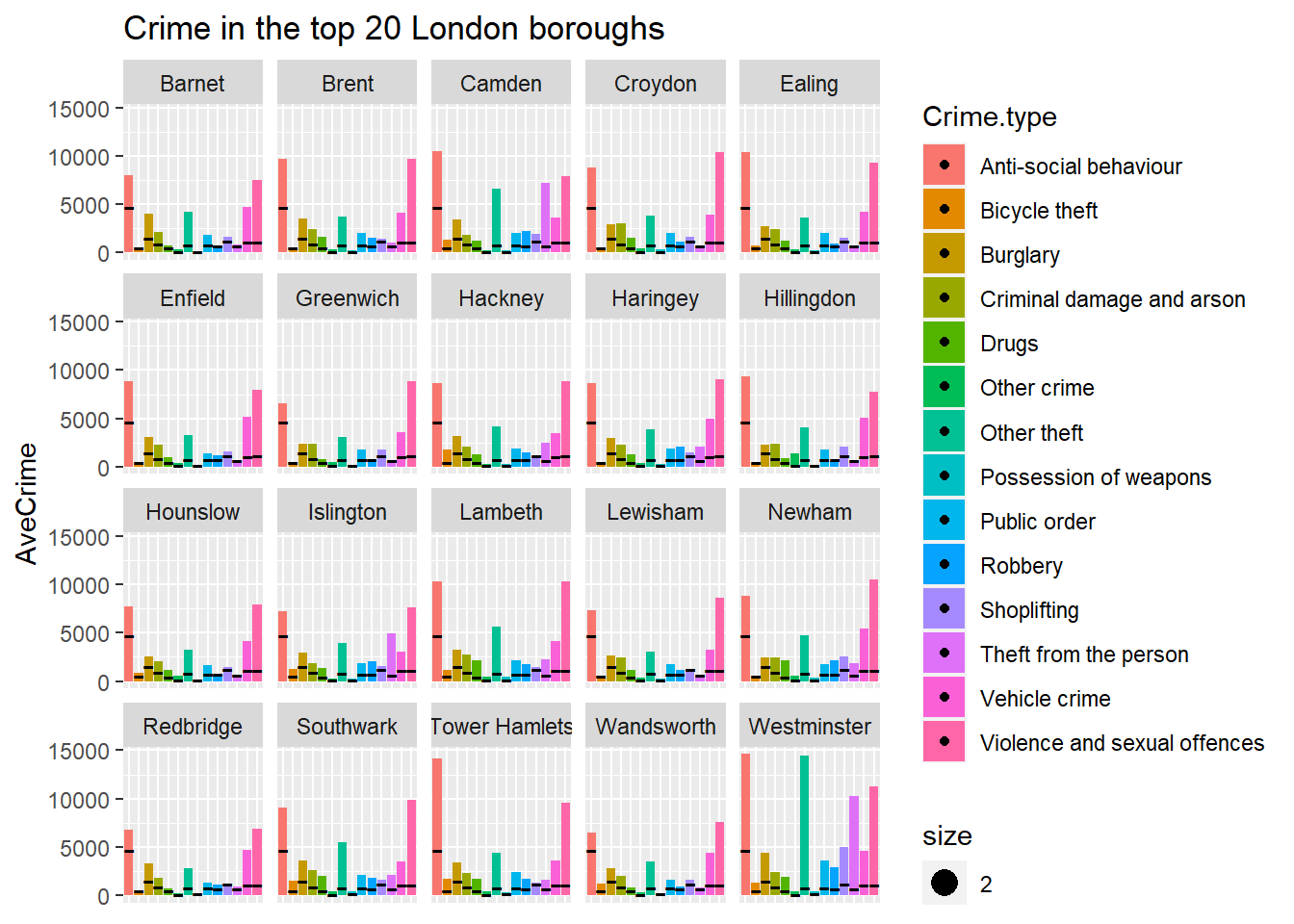
OK, so that’s great and all, but isn’t veeery useful because these LSOA areas are huge, and each contains so much variety in terms of “neighbourhood feels”“, we clearly need greater granularity… so let’s dig a bit deeper, perhaps a map would do us better….
Create a clustered crime map
OK, so perhaps a good idea would be to break up london into I don’t know, 1600 boxes, 40 by 40 and then I could figure out what’s the prevailing crime type in each region, after scaling the crime type in each area against the normal amount of that crime family in all London… this would give us a map where for example, we could tell that in a particular area, the prevailing crime type is “Shoplifting”, which ocurrs 2x more often than a normal neighbourhood. I also feel like (after inspecting the above), working with scaled traits will smooth out the fact that some crime types are more common than others overall. Let’s start messing around!
Let’s create a new data frame, this time w/ coordinates and crime type.
df <- df_large %>%
  select(Longitude,Latitude,Crime.type)
First Map:
head(df,100) %>%
leaflet() %>%
  addTiles() %>%
  addMarkers(lng = ~Longitude, lat = ~Latitude)


OK, so clearly the dataset contains some non-London entries (so perhaps Metropolitan Police is for several metropolises? [Edit: yes, Metro Police is responsible for other Metropoli (don’t care if that’s not the plural… it’s awesome and I’m sticking to it). Also, there are 2 other forces not included in this analysis: City of London police City of London and British Transport Police police do anything to do with railways overground underground or DLR.])! Let’s Truncate these to London only. I manually estimated the London limit coordinates from google maps using the M25 ring road as the limits, apologies if this isn’t an accurate representation of London:
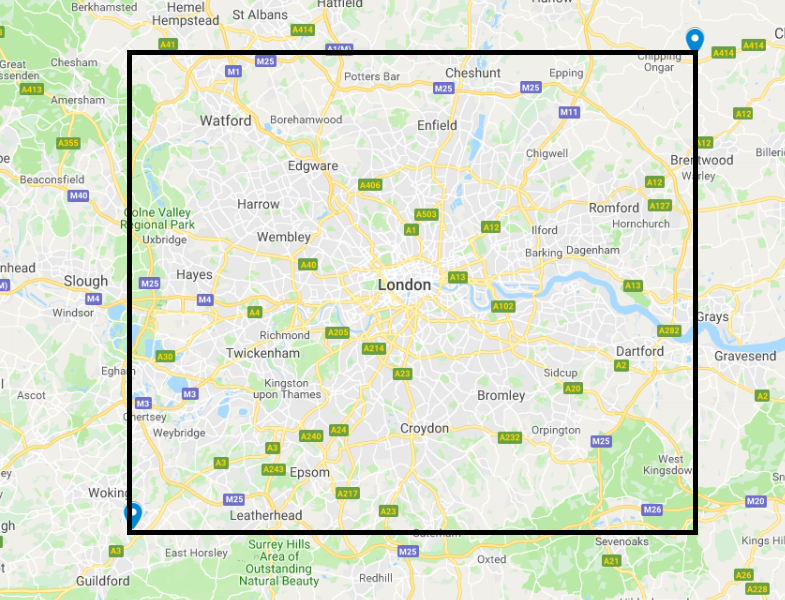
df <- df %>%
  filter(Latitude < 51.715036,
         Latitude > 51.282286,
         Longitude < 0.296875,
         Longitude > -0.527704)
OK, let’s create tiles. Very unscientificially, I figured out that if I divide the coords by 0.1, that should more or less do it. Also we create an ID that concatenates the relative positions so that we can more easily refer to each tile by it’s “Unique IDentifier” (UID).
df <- df %>%
  mutate(LatDelta = round((Latitude  - min(Latitude))/.1,1)) %>%
  mutate(LongDelta = round((Longitude  - min(Longitude))/.1,1)) %>%
  mutate(UID = paste0(LatDelta,"|", LongDelta))

df %>% pull(LatDelta) %>% unique %>% length; df %>% pull(LongDelta) %>% unique %>% length
## [1] 44## [1] 82Yup ^ I get about 44 squares wide by 82 squares long. This is very clearly almost exactly the 40 x 40 grid, so let’s go with that :-). (Extra credit to those that are wondering how a more or less square can be 44 x 82. Extra extra credit to those that know why).
Average crime
I’m actually not sure what’s the best way to figure out the average amount of crime per area. Maybe after we figure out how many of each type of crime has occurred in a tile we can scale it to compare against the general amount of each crime. I did something similar in the video… just more inefficiently (remember, we aren’t judging!). Lastly, let’s just grab a general number of crimes per tile, to show a scale of general criminality in each area:
UIDCrimes <- df %>%
  select(UID,Crime.type) %>%
  group_by(UID, Crime.type) %>%
  ## Just the count per crime type and area
  summarize(n = n()) %>%
  group_by(Crime.type) %>%
  ## Scaling n against the overall amount of each crime
  mutate(sc_n = scale(n,center = FALSE)) %>%
  group_by(UID) %>%
  ## Just a total sum of all crime in each area
  mutate(total_crime = sum(n)) %>%
  ungroup # %>% mutate(total_crime = scale(total_crime ))
## `summarise()` has grouped output by 'UID'. You can override using the `.groups` argument. ## ^ commented out part is experimenting w/ scaled totals... don't like it
UIDCrimes %>% sample_n(10)## # A tibble: 10 x 5
## UID Crime.type n sc_n[,1] total_crime
## <chr> <chr> <int> <dbl> <int>
## 1 1.5|1.6 Theft from the person 4 0.0290 178
## 2 1.4|1.6 Criminal damage and arson 17 0.362 248
## 3 1.4|6.4 Robbery 2 0.0472 42
## 4 3.4|4.8 Theft from the person 1 0.00725 91
## 5 2|3.9 Robbery 51 1.20 1564
## 6 2.8|0.7 Criminal damage and arson 15 0.320 229
## 7 1|6.7 Criminal damage and arson 1 0.0213 4
## 8 3.4|2.5 Anti-social behaviour 59 0.288 294
## 9 2.4|4.1 Other theft 355 2.38 2937
## 10 0.8|5.1 Violence and sexual offences 5 0.0273 15OK, so now we more or less know how each crime type in each area stacks up against other areas in London… and perhaps this is the information we wanted to know… let’s take a look at one random area:
UIDCrimes %>% filter(UID == "2.1|5.8") ## # A tibble: 14 x 5
## UID Crime.type n sc_n[,1] total_crime
## <chr> <chr> <int> <dbl> <int>
## 1 2.1|5.8 Anti-social behaviour 408 1.99 1796
## 2 2.1|5.8 Bicycle theft 13 0.408 1796
## 3 2.1|5.8 Burglary 60 0.927 1796
## 4 2.1|5.8 Criminal damage and arson 80 1.70 1796
## 5 2.1|5.8 Drugs 51 1.35 1796
## 6 2.1|5.8 Other crime 11 0.571 1796
## 7 2.1|5.8 Other theft 154 1.03 1796
## 8 2.1|5.8 Possession of weapons 21 2.27 1796
## 9 2.1|5.8 Public order 123 2.59 1796
## 10 2.1|5.8 Robbery 45 1.06 1796
## 11 2.1|5.8 Shoplifting 381 3.86 1796
## 12 2.1|5.8 Theft from the person 53 0.384 1796
## 13 2.1|5.8 Vehicle crime 59 0.724 1796
## 14 2.1|5.8 Violence and sexual offences 337 1.84 1796We can see from above that even though in sheer numbers, “Violence and sexual offences” is the most prominent type (n = 55), we can see that when we consider this within the general perspective of greater London, we see that “Public Order” is a much more anomolous result (sc_n = 1.51)… OK, knowing this, let’s pick highest crime type for each area:
UIDCrimes <- UIDCrimes %>%
  group_by(UID) %>%
  filter(sc_n == max(sc_n))
Let’s add back in the mean Lat & Long for each tile, since that’s going to be each tile’s centeroid, and get it ready for printing by adding a more informative note for mouseover.
PlotDF <- df %>%
  group_by(UID) %>%
  summarize(AveLong = mean(Longitude),
            AveLat = mean(Latitude)) %>%
  full_join(UIDCrimes,by = "UID") %>%
  # mutate(Crime.type = gsub(" ","<br>",Crime.type)) %>%
  mutate(Note = paste0(UID, " - Total crimes: ", total_crime, "<br>",
                       "Number of specific crimes: ", n, "<br>", Crime.type ))

head(PlotDF)
## # A tibble: 6 x 8
## UID AveLong AveLat Crime.type n sc_n[,1] total_crime Note
## <chr> <dbl> <dbl> <chr> <int> <dbl> <int> <chr>
## 1 0.1|2.9 -0.225 51.3 Vehicle crime 1 0.0123 1 0.1|2.9 - Tot~
## 2 0.1|3.3 -0.189 51.3 Other theft 1 0.00669 1 0.1|3.3 - Tot~
## 3 0.1|3.6 -0.155 51.3 Criminal dam~ 1 0.0213 6 0.1|3.6 - Tot~
## 4 0.1|3.7 -0.143 51.3 Drugs 1 0.0264 3 0.1|3.7 - Tot~
## 5 0.1|3.9 -0.124 51.3 Other crime 2 0.104 36 0.1|3.9 - Tot~
## 6 0.1|4 -0.115 51.3 Possession o~ 2 0.216 40 0.1|4 - Total~# PlotDF$N2Crime %>% plotAnd here we go, let’s map it, using a different color for each crime type, and the intensity of each dot being the scaled prevalence of total crime!
Try1 <- c("red", "green", "blue")
Try2 <- c('#e6194b', '#3cb44b', '#ffe119', '#4363d8', '#f58231', '#911eb4', '#46f0f0', '#f032e6', '#bcf60c', '#fabebe', '#008080', '#e6beff', '#9a6324', '#fffac8', '#800000', '#aaffc3', '#808000', '#ffd8b1', '#000075', '#808080', '#ffffff', '#000000')
Try3 <- c('#808080', '#800000', '#800000', '#FF0000', '#808000', '#FFFF00', '#008000', '#00FF00', '#008080', '#00FFFF', '#000080', '#0000FF', '#800080', '#FF00FF','#000000')

pal <- colorFactor(Try3, domain = unique(PlotDF$Crime.type))

leaflet(PlotDF) %>%
  addTiles() %>%
  addCircleMarkers(lng = ~AveLong, lat = ~AveLat,
                   fillColor = ~pal(Crime.type),
                   stroke = FALSE,
                   fillOpacity = ~total_crime/max(total_crime)*3,
                   label = lapply(PlotDF$Note, htmltools::HTML)) %>% #  labelOptions = labelOptions(permanent = TRUE)
  addLegend("topright", pal = pal, values = ~Crime.type,
            title = "Crime Type",
            opacity = 1
  )

Bicycle theft
Burglary
Criminal damage and arson
Drugs
Other crime
Other theft
Possession of weapons
Public order
Robbery
Shoplifting
Theft from the person
Vehicle crime
Violence and sexual offences
#   addCircleMarkers(lng = ~AveLong, lat = ~AveLat,fillColor = ~pal(Crime.type), stroke = FALSE, label = lapply(PlotDF$Crime.type, htmltools::HTML))
#
# addLabelOnlyMarkers(~AveLong, ~AveLat, label =  lapply(PlotDF$Crime.type, htmltools::HTML),#~as.character(Crime.type),
#                       labelOptions = labelOptions(style = "color:red", noHide = T, direction = 'center', opacity = ~sc_n, textOnly = T))
A few observations…
- if we take a look, the center of London is MUCH more violent than the peripheries, in terms of sheer numbers of crime (EDIT: it’s been brought to my attention that amount of crime really does depend on oportunity, so it’s much more frequent when discussing crime data to divide by a specific denominator (for example, number of pedestrians). Read more about denominators here).
- The color choice is a bit unfortunate for 2 reasons. 1) there’s just too many categories, and 2) I am also modifying the opacity of each dot with additional information… I have tried after a bit of messing around to find the color scale that maximizes identifiability, but unfortunately the result is a fairly ugly map. Ideally we should collapse all these into fewer categories, but considering I have NO knowledge of this subject matter, probably I should leave well enough alone.
- It also needs to be said, that not all crime types are the same, and this might affect the perception of criminality in each area. There are crime surveys that contain excellent data for England and Wales, as well as public attitudes surveys that are useful to read if you’re interested in how crime is being percieved. Also important to mention that you can’t track crime that isn’t being reported, so please do take into consideration and bring to your awareness how much crime is missing from here, so called the ‘dark figure of crime’).
- This analysis also doesn’t consider the effect of the police or the legal reaction to crime, so I just want to be very clear that this analysis probably shouldn’t be used for any REAL purpose.
- And this one is a biggie. When working with large datasets it can be easy to forget that we are dealing with people’s lives. Every single number in this analysis represents a negative moment, some of which will be leaving permanent scars. Behind every single number there is also a criminal, which represents a failure on society’s part to properly socialize the individual. I understand that zero crime is impossible, but we, as a society should be holding ourselves responsible and at least asking questions from our regulators about how they are not addressing criminality, but the underlying causes of hopelessness and criminal behavior.
As a final note, and in consideration of point 5 above, I would like to say, if anyone has any concerns about this analysis for any reason, please reach out to me and I will be happy to listen.
Thanks to Reka for excellent feedback!