Across the world, the COVID 19 pandemic has illustrated how important it is for governments to have the ability to gather, action, and disseminate new case data as close to real time as possible. Luckily in the UK, there is a reasonably good flow of information about new cases. The government has released an interactive map of cases, and they do keep it up to date. This map uses the Middle Super Output Area (MSOA) level of granularity (i.e. not SUUUUPER detailed, but a good place to start), and shows the total number of cases to date. This methodology is really excellent as a first step, but has two important drawbacks:
- It doesn’t show the trend (i.e., whether the 43 cases occurred in July or last week?)
- MSOA is pretty actionable, but some regulators need more granular information, using a smaller area called the Lower Super Output Area (LSOA).
Through my collaboration with the Corona Virus Tech Handbook, I met Hannah O’Rourke, who works with several Members of Parliament (MPs). An MP requested a slightly more actionable map of Manchester by LSOA, where areas of growing concern could be more easily visualized. Since I’m always looking for ways to make myself useful during the COVID response, I offered to do this map pro bono.
Here is a screenshot of the result:
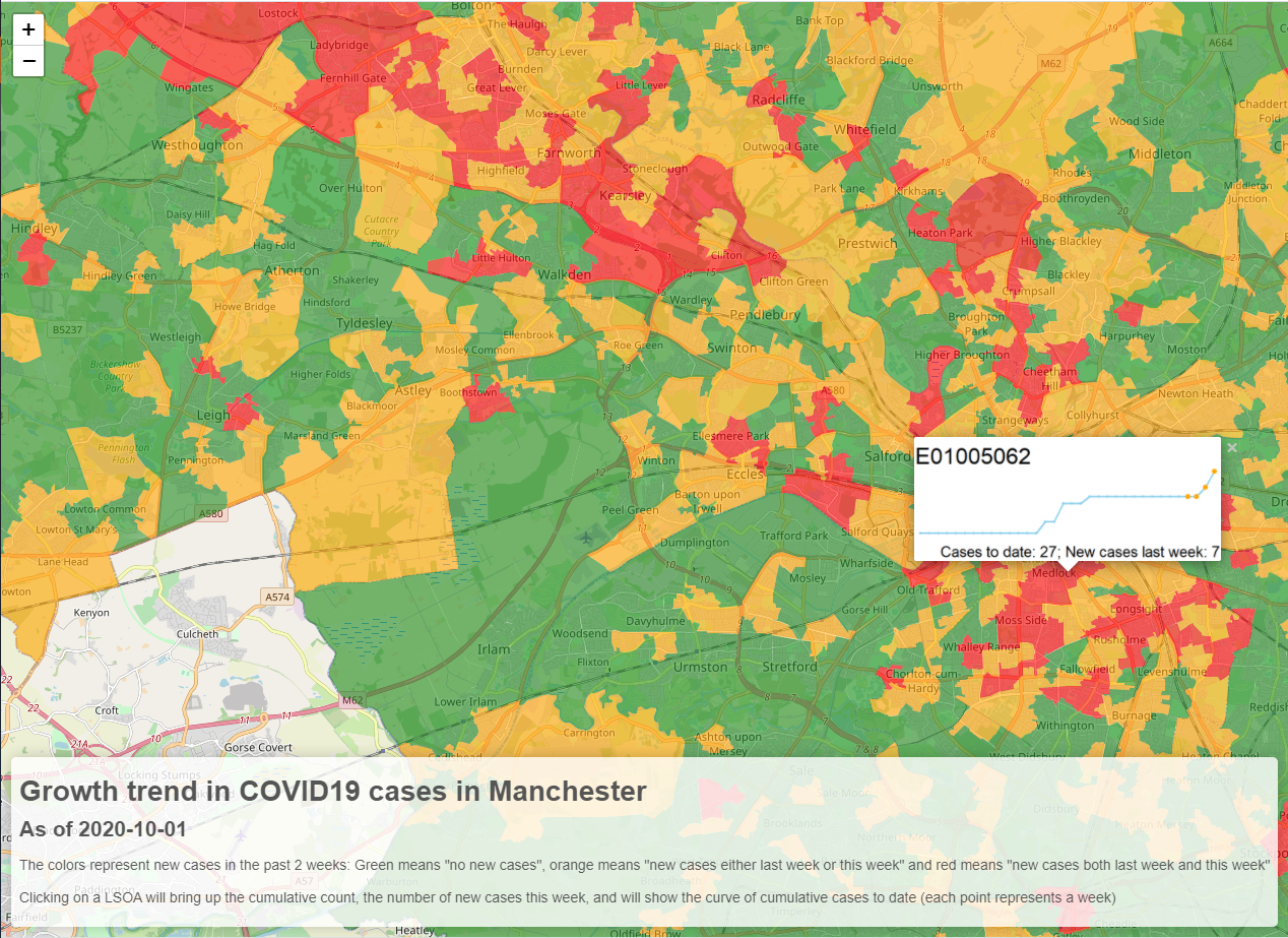
The above map is called a chloropleth and it differs from a normal map in that the data conforms to the shape of the LSOA rather than just showing points on a map. Leaflet was the obvious choice to make the map itself. I did explore ggplot + plotly, but I found the resulting plot a bit sluggish. Furthermore, it limited the content users could see when they clicked on an area of the map. That would have been a pity, since I really wanted to create custom details for each LSOA.
What I wanted to do was show a trendline tracking the cumulative cases over time. So I thought a sparkline-looking chart would be effective in showing the number of cases by LSOA as well as the new cases in the last few weeks. I saved each chart as a free-standing image in a folder that would be available to Leaflet. This used to be a massive pain to do since Leaflet generates its own web server dynamically on the localhost, and it wouldn’t find images unless you had copied them into a specific dynamic folder. But now it’s a breeze because of the package leafpop, which finally treats custom pictures the way you thought Leaflet should.
One challenge I faced was ensuring that after I had joined the data to the shape file (the file that contains the position information for each LSOA), I reassigned the actual shape file areas in the correct order. This sounds trivial, but it was actually pretty challenging, since I was assigning filters to both the shape object and the LSOA COVID cases dataset!
The other challenge I had was that when it came time to publishing the map, my chrome window was truly struggling to show the map as I designed it. But thanks to some quick help from the awesome Joe Cheng, we identified that the areas could be simplified pretty significantly. Thanks to the command rmapshaper::ms_simplify(), the size of my object dropped from 22 MB to 2.9 MB!
I would like to make this kind of map available to more areas of the UK, but sadly, the government is no longer publishing data by LSOA. Still, it helped the MP at a time when he needed more detailed data, and this idea will be kept online in case anyone else can benefit from it.
Please see the interactive map here (it takes a few seconds to load).
The code I developed is published below. Unfortunately it won’t work anymore due to the LSOA data not being updated, but you can at least see how I did it.
### Map LSOA of COVID cases

## LSOA shp file from https://datashare.is.ed.ac.uk/handle/10283/2546

library(tidyverse)
library(sf)
options(scipen=999)

## Bring in shp file
sh <- sf::st_read("c:/data/geo/LSOA_2011_EW_BFC_shp/LSOA_2011_EW_BFC.shp")

# sh %>% tail(1) %>% plot

## Filter to Manchester
sh <- sh %>% filter(grepl("Bolton|Bury|Oldham|Rochdale|Stockport|Tameside|Trafford|Wigan|Manchester|Salford", x = LSOA11NM))
# sh %>% tail(1) %>% pull(LSOA11CD)
# sh %>% tail(1) %>% plot

## bring in data
df <- read_csv("https://coronavirus.data.gov.uk/downloads/lsoa_data/LSOAs_latest.csv") %>%
  rename(LSOA11CD = lsoa11_cd) %>%
  mutate(across(everything(), ~ifelse(. == -99, NA, .))) # %>%
filter(grepl("Bolton|Bury|Oldham|Rochdale|Stockport|Tameside|Trafford|Wigan|Manchester|Salford", x = lsoa11_nm ))

splitDF <- df %>%
  select(LSOA11CD ,(ncol(df) - 3):ncol(df)) %>%
  mutate(across(everything(), ~ifelse(is.na(.), 0, .))) %>%
  pivot_longer(-LSOA11CD) %>% select(-name) %>%
  split(.$LSOA11CD) %>% map(~tail(., 2))

df1 <- splitDF %>%
  map(~case_when(
    .$value[1] == 0 & .$value[2] == 0 ~ "nothing",
    .$value[1] == 0 & .$value[2] != 0 ~ "peak",
    .$value[1] != 0 & .$value[2] != 0 ~ "doublepeak",
    TRUE ~ "lastpeak"
  )) %>% enframe %>% unnest(value) %>%
  rename(LSOA11CD = name)


## unite this into the data, and bring back geography, and last week and this week

# bof <- df1 %>% as.data.frame %>% right_join(sh, by = "LSOA11CD")
bof <- df1 %>% as.data.frame %>%
  merge(., sh, by = "LSOA11CD") %>%
  merge(., df %>%
          select(LSOA11CD ,(ncol(df) - 1):ncol(df)) %>%
          set_names(c("LSOA11CD", "last_wk", "this_wk")),
        by = "LSOA11CD") %>%
  mutate(lab = paste0(LSOA11CD, ": <br>last week ", last_wk, "; this week ", this_wk)) %>%
  select(-last_wk, -this_wk) %>%
  arrange(LSOA11CD)

st_geometry(bof) <- sh %>%
  arrange(LSOA11CD) %>%
  filter(LSOA11CD %in% bof$LSOA11CD) %>% pull(geometry)

# let's create little sparklines for each popup ---------------------------
## BUT!! We have to make sure htat there's exactly the right number of images as in the map
## Otherwise there will be a mismatch. So first, let's just create a blank image for EVERY entry
##################


# Create popup images -----------------------------------------------------
list.files(path = "out_manchester/graphs", full.names = TRUE) %>%
  file.remove()

blankChart <- tibble(x=1,y=1) %>% ggplot(aes(x,y, label = "NO DATA")) +
  geom_text() + theme_void()

ggsave(filename = paste0("out_manchester/graphs/blank.png"), plot = blankChart, width = 2.5, height = 1)

## now copy this image to all entries in bof:
bof$LSOA11CD %>% paste0("out_manchester/graphs/", ., ".png") %>%
  map(~file.copy(from = "out_manchester/graphs/blank.png", to = ., overwrite = TRUE))

file.remove("out_manchester/graphs/blank.png")

## OK, now proceed with real data:
splitDFFULL <- df %>%
  filter(grepl("Bolton|Bury|Oldham|Rochdale|Stockport|Tameside|Trafford|Wigan|Manchester|Salford", x = lsoa11_nm )) %>%
  select(LSOA11CD , contains("wk")) %>%
  mutate(across(everything(), ~ifelse(is.na(.), 0, .))) %>%
  pivot_longer(-LSOA11CD) %>%
  group_by(LSOA11CD) %>% mutate(cumulative_cases = cumsum(value)) %>% ungroup %>%
  split(.$LSOA11CD)

# splitDFFULL[[1]] %>% plotter

plotter <- function(x){
  cumu <- x %>% tail(1) %>% pull(cumulative_cases)
  latest <- x %>% tail(1) %>% pull(value)

  a <- x %>% ggplot(data = ., aes(name, cumulative_cases, group = 1)) +
    geom_line(color="skyblue") +
    geom_point(size = 0.3, color="skyblue") +
    geom_point(data = tail(x,4), size = 1, color="orange") +
    theme_void() +
    labs(title = x[1,1],
         caption = paste0("Cases to date: ", cumu, "; New cases last week: ", latest))

  ggsave(filename = paste0("out_manchester/graphs/", x[1,1],".png"), plot = a, width = 2.5, height = 1)
}

# splitDFFULL[[1]] %>% plotter
splitDFFULL %>% map(plotter)


# Interactive! ------------------------------------------------------------
library(leaflet)

WGS84 <- st_transform(bof, 4326) %>%
  mutate(fn = paste0("out_manchester/graphs/", LSOA11CD, ".png"))

## Check size and simplify:
object.size(WGS84)
simplified <- rmapshaper::ms_simplify(WGS84)
object.size(simplified)

library(leafpop)
library(htmlwidgets)
library(htmltools)

# # Loaded random pictures on my laptop
# images <- list.files("out/graphs", full.names = TRUE) %>% sort
#
# ## Make sure that there's the same number of files in images are there are names in bof.
# testthat::expect_equal(length(images), nrow(simplified) + 1)

## make map
finished <- simplified %>%
  mutate(col = case_when(
    value == "doublepeak" ~ "red",
    value == "peak" | value == "lastpeak" ~ "orange",
    value == "nothing" ~ "forestgreen",
  )) %>%
  # head(600) %>%
  leaflet() %>%
  addTiles() %>%
  addPolygons(
    stroke = FALSE, # remove polygon borders
    fillColor = ~col,
    # fillColor = ~pal(val), # set fill color with function from above and value
    fillOpacity = 0.6, color = "white", smoothFactor = 0.5, # make it nicer
    popup = ~popupImage(fn)
    # popup = popupImage(images)
    # popup = p_popup
  )

# ## add legend
# finished <- finished %>%
#   addLegend(pal = pal, values = ~value, opacity = 0.7, title = NULL,
#             position = "bottomright")

## add title and explanation
rr <- tags$div(
  HTML(paste0('<h1> Growth trend in COVID19 cases in Manchester</h1>
        <h2> As of ', Sys.Date(), '</h2>',
              '<p>The colors represent new cases in the past 2 weeks: Green means "no new cases",
       orange means "new cases either last week or this week" and red means "new cases both
       last week and this week"</p>
       <p>Clicking on a LSOA will bring up the cumulative count, the number of new
       cases this week, and will show the curve of cumulative cases to date (each point represents a week)</p>'
  )))


## Combine the two
map_leaflet <- finished %>%
  addControl(rr, position = "bottomleft")

saveWidget(map_leaflet, file="manchester.html",selfcontained = FALSE)

file.copy("manchester.html", "out_manchester/viz/manchester.html", overwrite = TRUE)
R.utils::copyDirectory("manchester_files/", "out_manchester/viz/manchester_files", recursive = TRUE)
file.remove("manchester.html")
unlink("manchester_files", recursive = TRUE)

beepr::beep(4)